What Marvel’s Branding Secrets Teach Us About Timeless Design
The Marvel logo doesn’t just brand a company—it summons a universe. With a flash of crimson and a bold, white “MARVEL,” it’s as iconic as Spider-Man’s web or Thor’s hammer, a visual battle cry that’s echoed from comic book racks to billion-dollar blockbusters. For anyone tinkering with an AI logo generator or dreaming of a brand as enduring as Captain America’s shield, the Marvel logo offers a masterclass in design, identity, and cultural staying power. In this 2,800-word odyssey, we’ll trace the Marvel logo history, unpack its design genius, and share modern logo design tips—including how to wield an AI logo generator without watermark to create your own heroic emblem. So, buckle up, true believers, and let’s dive into the super heroic saga of Marvel’s logo.
The Birth of the Marvel Logo: From Timely to Titan
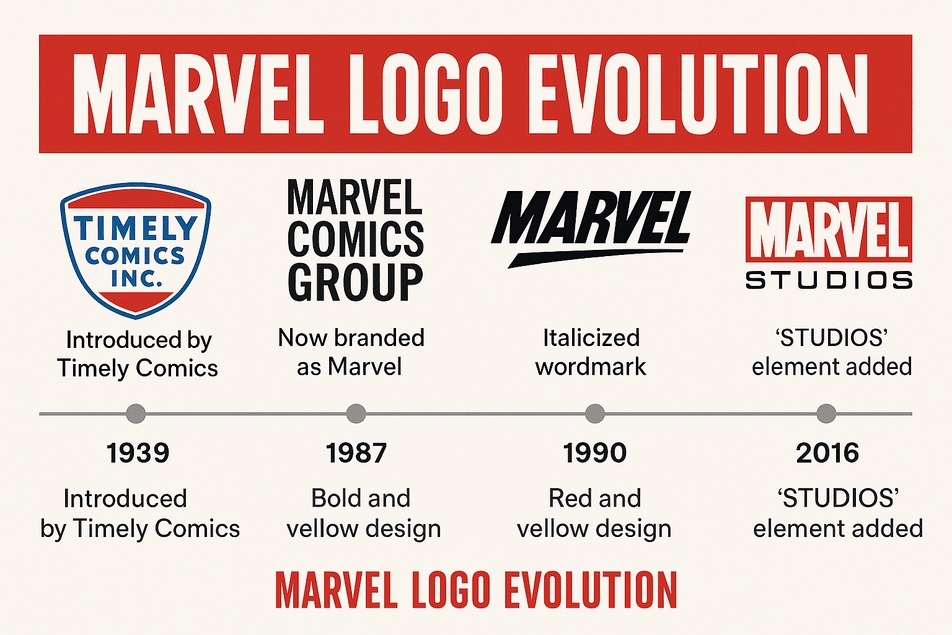
Before Marvel was Marvel, it was Timely Comics, a scrappy pulp publisher born in 1939 under Martin Goodman’s watch. The original Marvel logo—or rather, Timely’s—was a no-frills shield with “Timely Comics Inc.” in blue and white, as utilitarian as a wartime ration book. It did the job but lacked the pizzazz of a superhero landing. By 1961, the company rebranded as Marvel Comics, and the logo took its first leap: a boxy “MC” stack, soon replaced by a bold “Marvel Comics Group” masthead in 1963. As Stan Lee once said, “We wanted a logo that screamed, ‘Open this, and you’re in for something wild!’”
This early logo was a promise of adventure, its blocky letters evoking newsstand headlines. For aspiring logo creators, the takeaway is clear: your logo doesn’t need to be perfect out of the gate, but it must be clear. Even the best free AI logo creator tools like Looka or Canva can churn out a clean, legible design if you start with a strong brief—think “bold, adventurous, comic-book vibe.”
Color Psychology and Brand Perception: The Power of Red
Let’s talk about that red. The modern Marvel logo, cemented in 2002, is a crimson slab with stark white letters—a visual punch that demands attention. Why red? In color psychology in logos, red is the superhero of hues: it’s urgent, exciting, and impossible to ignore. “Red is the color of action,” says color theorist Angela Wright. “It grabs you by the collar and says, ‘Pay attention!’” It’s no coincidence that red dominates Marvel’s universe, from Iron Man’s armor to Spider-Man’s suit.
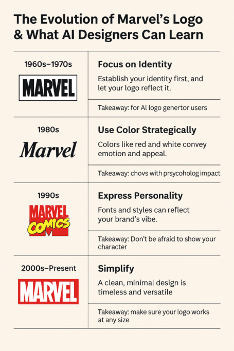
The white text, meanwhile, offers clarity and contrast, a typographic nod to purity and trust. Compare this to earlier iterations: the 1987 logo’s black-and-white italics screamed motion, while the 1990s’ red-and-yellow chaos was a teenage rebellion in design form. For those using an AI logo generator, the lesson is simple: color isn’t just decoration—it’s storytelling. Input prompts like “urgent red” or “heroic contrast” to capture Marvel’s bold energy.
Artistry, Typography, and Design Patterns: A Font for Heroes
Typography is a logo’s costume, and Marvel’s has tried on a few. Early logos used bulky, newsprint-style fonts that echoed comic book mastheads. By the late 1980s, Marvel embraced italics for a kinetic, forward-leaning vibe. The 1990s brought a wild experiment: a red “Marvel” paired with a yellow “Comics” and a bloated “M” that screamed garage-band energy. It was cluttered, chaotic, and gloriously of its time.
In 2002, designers Cyrus Highsmith and Tobias Frere-Jones (later refined by Rian Hughes in 2012) gave Marvel its modern look: a geometric, sans-serif typeface on a red rectangle. Clean, bold, and scalable, it’s a font that says, “This is epic, and we mean business.” For logo creators, the takeaway is to keep fonts era-appropriate. Using an AI logo generator without watermark like Semplr? Experiment with sans-serif options and tweak kerning for a polished, Marvel-esque finish.
Symbolism Behind the Monogram: A Signal of Epic Beginnings
The Marvel logo isn’t just a design—it’s a signal flare. The red rectangle is a frame for stories, a portal to adventure. The white “MARVEL” is a declaration of confidence, its subtle kerning (like the tight link between “V” and “E”) adding a touch of finesse. As designer Paula Scher notes, “A logo should feel like an invitation.” Marvel’s logo invites you to a universe of heroes, villains, and infinite possibilities. It’s a symbol that transcends comics, appearing on movie screens, theme park rides, and even AI-generated fan art.
Modernism and the Logo’s Timeless Appeal
Marvel’s 2002 logo is a modernist marvel—no gradients, no chrome, just a bold slab of brand. It’s Bauhaus with superpowers, as Dieter Rams might approve. The 2016 addition of “Studios” in black, flanked by clean dividers, gave it cinematic symmetry without losing its comic roots. This balance of nostalgia and innovation is why the Marvel logo endures. Compare it to DC’s logo, which has flip-flopped between gothic and minimalist, or Image Comics’ ever-changing designs. Marvel’s logo evolves without losing its soul, a lesson for anyone using modern logo design tips to craft a timeless emblem.
The Logo’s Role in Defining Fashion Eras
The Marvel logo has mirrored cultural shifts. In the 1960s, it was a comic book rebellion against conservative norms. The 1980s and 1990s saw it embrace bold, flashy designs as superhero comics exploded. By the 2000s, with the MCU’s rise, the logo became a cinematic badge, flashing before billion-dollar films. The 2016 “Studios” rebrand reflected Marvel’s shift from page to screen, aligning with a digital age where logos must work on Netflix thumbnails and IMAX screens. As The Hollywood Reporter noted in 2023, Marvel’s brand equity—logo included—helped the MCU gross over $30 billion globally.
Controversies: When Logos Stir the Pot
No logo is immune to drama. In 2008, Marvel trademarked its red-and-white slab, prompting raised eyebrows. Could a color combo be owned? Marvel argued it wasn’t just the colors but the “visual impression” that mattered—a legal move as savvy as Tony Stark’s tech. In 2016, the “Studios” addition sparked debate among comic purists who feared a dilution of Marvel’s roots. Yet, with box office records soaring, the logo proved its worth. For logo creators, the lesson is clear: your design should be distinctive enough to defend legally, whether crafted by hand or an AI logo generator.
Stock Price and Business Growth: The Logo as Equity
A logo isn’t just art—it’s a financial asset. When Disney acquired Marvel for $4 billion in 2009, the Marvel logo became a stamp of trust across films, theme parks, and merchandise. By 2025, Disney’s stock has climbed from $28 (2009) to over $120, with the MCU’s logo-flashed intros driving billions in revenue. Recent news from Bloomberg in 2025 highlights Marvel’s pivot to streaming, with the logo anchoring new Disney+ series like Agatha All Along. For logo makers, this underscores that a logo is more than a favicon—it’s a symbol of investor confidence.
Brand Identity and Consistency: The Superpower of Unity
Consistency is Marvel’s secret weapon. Despite tweaks, the Marvel logo has kept its red-and-white core, unifying comics, films, and merch. “A brand is a gut feeling,” says Marty Neumeier, and Marvel’s logo delivers that feeling across platforms. Recent campaigns, like the 2025 Thunderbolts teaser with its logo-centric animation, show how Marvel leverages its emblem for digital impact. For those using AI logo generator without watermark tools, consistency is key—ensure your design works everywhere, from business cards to billboards.
Design Lessons for Aspiring Logo Creators
What can you learn from the Marvel logo? Here are five principles:
- Simplicity: The red slab works at any size, from comics to IMAX.
- Personality: Each logo reflects its era’s vibe.
- Adaptability: It scales from print to digital seamlessly.
- Consistency: The red-and-white core unifies the brand.
- Resonance: It evokes heroism before the story begins.
Using an AI logo generator? Input these principles into your prompt for a design that punches like Marvel’s.
Messaging and Visual Language: Speaking to Heroes
The Marvel logo speaks a visual language of epic beginnings. The red says, “Get ready for action.” The white says, “Trust us.” The bold font says, “This is no amateur hour.” Recent X posts, like @MarvelStudios’ 2025 teaser for Captain America: Brave New World, show the logo sparking fan excitement with hashtags like #MarvelLogo. It’s a reminder that a logo isn’t just seen—it’s felt.
Hashtag History and Digital Ubiquity
The Marvel logo is a social media star. In 2020, fans flooded X with AI-generated logo remixes, turning #MarvelLogo into a global trend. By 2025, the logo’s animated intros dominate TikTok and Instagram, from fan edits to official MCU teasers. Its digital versatility makes it a case study in playful logo branding examples, proving a logo can be both iconic and meme-worthy.
The Impact of Technology and AI on Logo Design
From hand-drawn shields to digital animations, the Marvel logo has embraced tech. Early logos were inked by hand; by the 2000s, design software enabled crisp, scalable designs. Today, AI logo generators like Looka, Semplr, and Canva let anyone create Marvel-inspired logos. Input “bold red slab, heroic tone” into a best free AI logo creator tool, and you’re halfway to a blockbuster design. As Looka notes, “Our AI generates 100s of custom logos in seconds.” For small brands, this levels the playing field.
Marvel’s Products and Services: A Universe of Offerings
Marvel’s logo fronts a vast ecosystem: comics, MCU films, Disney+ series, theme park rides, and merch from Funko Pops to Spider-Man sneakers. Recent news from Variety in 2025 highlights Marvel’s push into gaming, with the logo branding upcoming titles like Marvel’s Wolverine. The logo’s versatility ties these products together, from $30 billion in box office revenue to $1 billion in annual merch sales.
Logo Comparison with Competitors: Marvel vs. the Comic Pack
How does the Marvel logo stack up? DC’s logo, with its minimalist “DC” circle, feels corporate but lacks Marvel’s warmth. Image Comics’ ever-shifting designs prioritize flexibility over consistency. Dark Horse’s logo is gritty but niche. Marvel’s red slab wins for its bold simplicity and universal appeal, a benchmark for logo creators aiming for impact.
How Marvel Might Use an AI Logo Generator Without Watermark
Imagine Marvel’s design team firing up an AI logo generator without watermark like Canva. They’d input “red, bold, heroic, cinematic,” and the AI might spit out a sleek variation of the red slab—perhaps with a neon glow for Gen Z or a 3D effect for VR campaigns. The result would retain Marvel’s essence while feeling fresh for 2025. Tools like Semplr make this accessible, offering watermark-free designs that rival professional work.
Tips for Readers: How to Create a Logo Using AI

Ready to craft your own heroic logo? Here’s how to use an AI logo generator to channel Marvel’s magic:
- Pick a Tool: Try best free AI logo creator tools like Looka, Semplr, or Canva for watermark-free designs.
- Define Your Brand: Use prompts like “bold, heroic, red” to capture your vibe.
- Leverage Color Psychology: Choose hues that evoke emotion—red for action, white for trust.
- Simplify: Marvel’s logo proves less is more. Avoid clutter.
- Ensure Versatility: Test your logo on apps, merch, and social media.
- Refine: Iterate with AI-generated options until it feels epic.
Conclusion: Brand Like a Superhero
The Marvel logo is more than a design—it’s a symbol of heroism, resilience, and cultural clout. From Timely’s humble shield to the MCU’s red slab, it’s evolved without losing its soul. For aspiring logo makers, it’s a reminder that great design tells a story. So, fire up an AI logo generator without watermark like Looka or Canva, channel Marvel’s bold spirit, and create a logo that’s ready to save the world—or at least your brand.
Excelsior.
“Try our free AI logo generator by prompt”
Link to related content:
“Check out our breakdown of Toblerone’s logo evolution”
