Unlocking Iconic Design From the First Draft to Digital Fame
What transforms a mere hockey insignia into a mark recognized from rinks to retail? The Winnipeg Jets logo, born of Northern pride and graphic precision, is a masterclass for every aspiring logo maker. Dive in as we explore how storytelling, sleek geometry, and color psychology have crafted an emblem that connects generations—plus practical pointers for creating your own striking brand mark.
The Birth of an Icon: Winnipeg Jets Logo Origins
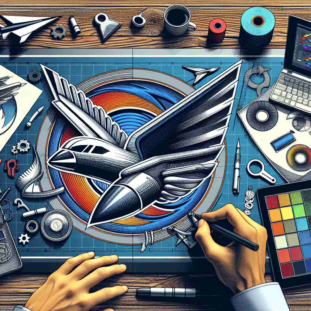
Long before it adorned center ice or inspired T-shirt trends, the Winnipeg Jets logo had to carve its own place in the world of sports iconography. When the reborn franchise took flight in 2011, its creative team faced a unique task: honor the legacy of the original Jets, who left the city in 1996, while crafting a modern identity for a new generation. Enter True North Sports & Entertainment, the franchise’s owners, who partnered with Reebok’s design unit to devise a mark that would unite past, present, and pride. Taking cues from Canada’s rich aviation tradition—Winnipeg is home to one of the nation’s key Royal Canadian Air Force bases—the designers fused the north’s grit with the crisp lines of a modern jet. Central to the logo’s DNA is the stylized fighter jet, seen soaring upward within a bold, red-trimmed maple leaf, a nod to both national heritage and local identity. The result is a crest that tells a multilayered story: one about a city’s revival, its love for hockey, and the power of symbolic reinvention. This blend of meaning, narrative, and geometry lays the foundation for any aspiring logo maker hoping to turn brand values into visual legend.
Color Psychology and Brand Perception
Color is never just color in logo design—and the Winnipeg Jets logo is a prime example. Each hue is a calculated decision, chosen for emotional resonance as much as for visual punch. The deep blue reflects the open prairies and crisp northern nights, symbolizing loyalty, trust, and depth. Silver-grey accents conjure the sheen of jet fuselages and evoke a cool, modern sophistication, while the splash of red both frames and energizes the mark, calling to mind Canada’s iconic maple leaf and the kinetic thrill of a breakaway goal. For new entrepreneurs and young designers, these lessons should not go unnoticed. The colors you choose can speak volumes about your brand’s values and aspirations. Blue infers professionalism and reliability; red signals energy and excitement; greys and silvers add technological edge. When testing a logo maker, experiment with palettes that resonate on an instinctual level—because your audience will feel them before they consciously decode them. The Jets’ palette succeeds not through novelty, but by leveraging color’s timeless associations to create instant credibility and emotional connection.
Design, Symbolism, and the Art of Storytelling
A truly memorable logo serves not just as a badge, but as a narrative device—and the Winnipeg Jets have achieved just that. The central fighter jet is rendered with clean, geometric lines, creating a sense of upward motion and dynamism, while doubling as a subtle homage to the Royal Canadian Air Force. The stylized maple leaf backdrop and circular format make it equally at home on a jersey, helmet, or digital screen. Great logos are built on layers of meaning. To the hockey faithful, the jet is both a literal and symbolic vessel: it signals strength, aspiration, and speed—values central to sport and business alike. The designers’ deft use of negative space gives the logo cohesion and flexibility at every scale, from arena signage to social media avatars. For readers eyeing their own entrepreneurial or creative journeys, the takeaway is clear: imbue your logo with meaning beyond the surface. Use symbolism, visual metaphors, and classic shape language to give your mark staying power. The Jets’ logo is a case study in distilling place, spirit, and ambition into a single, instantly recognizable image.
From Ice to Innovation: How to Create and Adapt Your Mark
As the Winnipeg Jets logo proves, adapting tradition for a digital era is essential. Today, the emblem translates seamlessly from physical merchandise to high-res screens, remaining crisp, clear, and compelling. But how does one channel that same spirit into their brand? Enter the modern logo maker—an entrepreneurial playground packed with AI-driven inspiration and customization power. Start by sketching your story—on paper, if you are feeling retro, or digitally, the twenty-first-century way. Consider the emotional impact of your palette, the story behind your symbol, and the role your logo will play across platforms. Use a logo maker to quickly iterate, test, and refine, exploring variations that echo the clarity and adaptability of the Jets’ identity. Aim for simplicity, readability, and versatility, with enough flair to stand the test of trend cycles. Need more inspiration? Explore how famous brands evolved their emblems over time at Branding 101: How To Build a Brand That Actually Sticks, or unravel design secrets on Nike’s Iconic Logos: A Comprehensive History and Analysis. With the lessons of the Winnipeg Jets logo—and the digital tools of today—your next design could become the symbol that defines a generation.
The Winnipeg Jets logo shows that inspiration, intent, and creative flair can turn a simple image into a timeless symbol. Its evolution is packed with lessons for anyone aiming to build their own identity using a logo maker. As you embark on your creative journey, remember: every great logo starts with a story—and a bold first draft.
