Introduction
Take a moment to picture the Apple logo, or the swoosh of Nike. Now think back to what those logos looked like a few decades ago. Surprised? Logos are not just symbols; they’re stories in visual form, and like every story, they evolve. Logo evolution is a crucial part of branding that reflects a company’s growth, its audience, and its place in time. In this article, we’ll explore how and why some of the world’s most famous logos have changed over time, what these changes mean, and what lessons we can learn from them. Whether you’re a designer, entrepreneur, or branding enthusiast, understanding logo evolution can give you a fresh perspective on the power of visual identity.
What Is Logo Evolution?
Logo evolution is the gradual or dramatic transformation of a logo over time to better align with a brand’s identity, goals, or market trends. This isn’t always about fixing something that’s broken. Often, it’s about modernizing, simplifying, or repositioning the brand to reflect new priorities. Successful logo evolution retains enough familiarity to stay recognizable while improving relevance and visual clarity.
Logos evolve for many reasons: mergers, leadership changes, product pivots, or simply the desire to stay current in a competitive landscape. As consumer preferences shift, brands must remain adaptable. A well-evolved logo keeps the brand fresh while preserving its core essence.
Iconic Examples of Logo Evolution
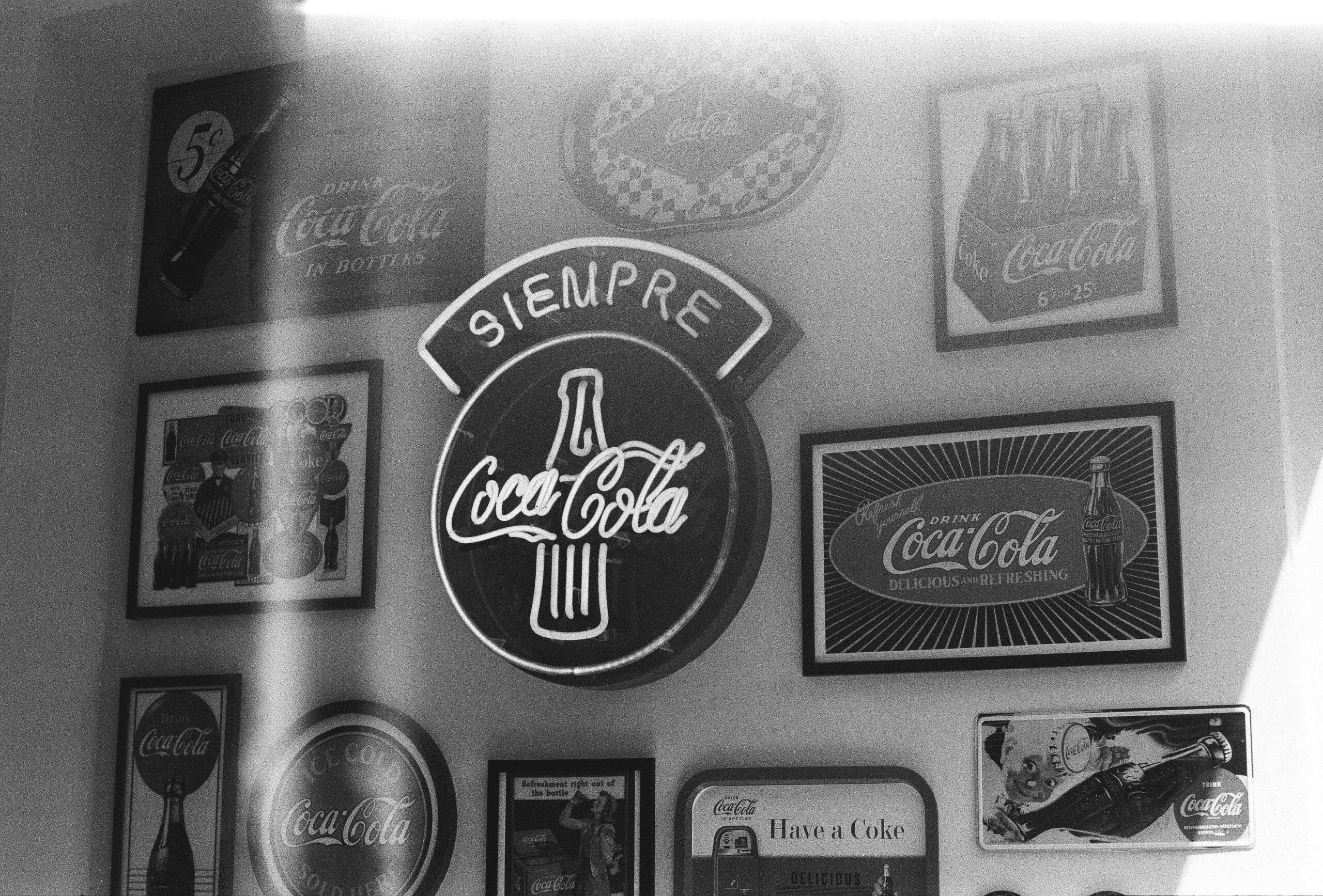
Apple: From Detailed to Iconic Simplicity Apple’s first logo in 1976 featured Isaac Newton sitting under a tree—a detailed and overly complex design. Just a year later, the brand embraced the now-famous apple silhouette, initially rainbow-colored to reflect its focus on color displays. Over time, the logo evolved into the sleek, monochromatic version we know today, perfectly aligning with Apple’s minimalist product design and tech-forward identity.
The modern Apple logo demonstrates how simplicity and symbolism can achieve lasting impact. Its evolution mirrors the brand’s journey from scrappy innovator to global design leader.
Nike: The Swoosh That Stayed Nike introduced its swoosh in 1971, designed by a graphic design student for just $35. Unlike many brands, Nike’s logo hasn’t drastically changed. The wordmark was eventually dropped, allowing the swoosh to stand alone. This minimal evolution speaks to the strength of the original concept and Nike’s consistent branding.
Nike proves that when a logo is instantly recognizable, it doesn’t need frequent updates. Their success lies in consistent storytelling and building emotional resonance with the logo.
Pepsi: A Timeline of Trends Pepsi has undergone numerous redesigns since its script-style logo in the 1890s. Its most radical change came in 2008 when it unveiled a “smile” version of its globe icon, meant to reflect movement and modern energy. Though criticized by some for its cost and similarity to previous designs, the evolution underscores Pepsi’s ongoing effort to remain youthful and relevant.
The Pepsi logo’s frequent changes also highlight the brand’s desire to stay culturally current and appeal to younger demographics. However, not all consumers appreciate constant changes—consistency often fosters loyalty.
Starbucks: Simplifying for Global Reach Starbucks’ original logo in 1971 featured a detailed mermaid with a two-tailed siren. Over the years, the logo was refined, and by 2011, the wordmark was removed entirely, leaving just the siren. The logo’s evolution made it easier to recognize and scalable across global markets without language barriers.
By embracing a symbol-only approach, Starbucks signaled its transformation into more than just a coffee shop—a lifestyle brand with global recognition. The logo evolution helped reinforce this shift.
Instagram: A Bold Leap Forward In 2016, Instagram made a daring shift from its skeuomorphic camera icon to a flat, gradient-filled glyph. The change was divisive at first, but it helped reposition the app as a vibrant, forward-looking platform. It’s now one of the most recognizable app icons in the world.
Instagram’s redesign showed the power of embracing modern aesthetics. It emphasized emotion and creativity over literal representation—a smart move given its visually driven user base.
What Drives Logo Changes?
- Design Trends: Flat design, responsive logos, and minimalism have reshaped visual branding across industries.
- Digital Use: Logos must be clear and adaptable across a variety of screen sizes and platforms.
- Global Expansion: Companies simplify logos to make them universally recognizable.
- Audience Shift: As brands target new demographics, logos need to reflect those preferences.
- Mergers and Acquisitions: A new logo can symbolize the union of two entities and a fresh start.
- Crisis or Repositioning: Rebranding can help a company recover from public backlash or shift market perception., logos need to reflect those preferences.
How to Approach a Logo Redesign
- Start with Brand Clarity: Know what your brand stands for and where it’s headed.
- Audit the Current Logo: What works? What doesn’t? What do people associate it with?
- Respect the Past: Retain familiar elements when possible to maintain recognition.
- Design for the Future: Think long-term. Will this logo still work in 5-10 years?
- Test It: Collect feedback from your audience before committing.
- Work with Professionals: A skilled designer can translate your brand story into a compelling visual identity.
Lessons from Logo Evolution
- Don’t Evolve Just for the Sake of It. Every change should serve a strategic purpose.
- Simplicity Wins. The most successful logos are often the simplest.
- Consistency Matters. A logo should reflect your brand personality across all platforms.
- Listen to Feedback. Good design is about your audience, not just your team.
- Tell a Story. A great logo isn’t just a mark—it conveys emotion, purpose, and heritage.
Logo evolution is more than a cosmetic refresh; it’s a reflection of a brand’s growth, values, and vision. Whether it’s a subtle update or a complete overhaul, the best logo transformations strike a balance between innovation and familiarity. If your brand is thinking about evolving its logo, take a cue from these iconic examples and focus on what really matters: telling a story that resonates.