Creating a successful logo can be tricky. A logo represents the heart and soul of a brand, making a lasting impression in just a split second. But sometimes, things go terribly wrong. Let’s take a look at 10 of the worst logo fails in history and explore what went wrong—and what we can learn from these mistakes.
1. Gap (2010 Rebrand)

What Went Wrong:
In 2010, Gap unveiled a new logo that was instantly met with backlash. The redesign featured a modern font with a small, almost insignificant blue square in the top-right corner. The result? A sterile, generic design that was a far cry from Gap’s established, recognizable brand.
What We Can Learn:
Never underestimate the power of your brand’s history. A logo needs to align with the values and personality of the company. Gap quickly realized this mistake and reverted to the old logo within a week. When rebranding, ensure you strike a balance between modernity and brand recognition.
2. Pepsi (2008 Rebrand)

What Went Wrong:
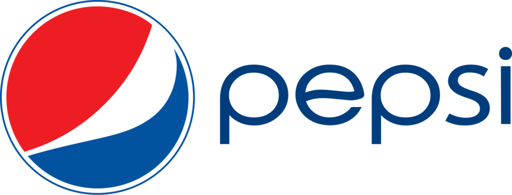
Pepsi’s 2008 logo overhaul sparked controversy because the new design featured a more abstract, almost unrecognizable look. The red, white, and blue color scheme was maintained, but the new logo appeared too complicated, and the use of curves made it difficult for people to connect with the brand.
What We Can Learn:
While the logo did try to convey a more dynamic and modern brand image, it alienated loyal consumers. The lesson here? Simplicity and consistency matter. A logo shouldn’t require a deep explanation. It should be clear, bold, and easy to understand at first glance.
3. Tropicana (2009 Rebrand)

What Went Wrong:
Tropicana decided to refresh its logo in 2009, removing the iconic “orange with a straw” image in favor of a more minimalist design. The new packaging was dull, and consumers complained they couldn’t recognize the product on the shelves.
What We Can Learn:
A logo’s goal is to stand out, not blend in. Tropicana’s attempt at a more modern look failed because it lost the key visual elements that made it recognizable. This teaches us that changing too much too quickly can be detrimental to a brand’s identity. Sometimes, less is more, but be careful not to lose your iconic elements.
4. BBC (1997 Rebrand)

What Went Wrong:
In 1997, the BBC launched a new logo with a more abstract look. While the new logo was cleaner, it was also incredibly basic—just three black squares. The public didn’t feel the change reflected the BBC’s high standards or rich history.
What We Can Learn:
Simplicity doesn’t always mean effective. When simplifying a logo, you must maintain a strong connection to the brand’s values and legacy. The logo should tell the story of the brand, not just appear as a minimalist design.
5. London 2012 Olympics Logo

What Went Wrong:
The London 2012 Olympics logo was highly controversial. Its jagged design, with sharp angles and bright colors, was meant to be bold and edgy. However, the public’s reaction was overwhelmingly negative, with many describing the logo as awkward and difficult to understand.
What We Can Learn:
Sometimes, being “edgy” and “different” doesn’t necessarily translate to success. A logo should evoke positive emotions and be easy for people to connect with. The London Olympics logo’s overly bold approach created confusion, leaving people questioning what it even represented.
6. Yahoo! (2013 Rebrand)
![Yahoo's original logo, the 2009 update, and 2013 redesign. [Images: Yahoo]](https://www.logoluv.com/wp-content/uploads/2025/04/14-yahoos-new-logo-1024x720.webp)
What Went Wrong:
In 2013, Yahoo! updated its logo but retained the exclamation point. The redesign introduced a slimmer typeface and maintained the purple color scheme. While the update was subtle, some critics felt it didn’t significantly differentiate Yahoo! from other tech companiesy.
What We Can Learn:
Even subtle logo changes can impact brand perception. It’s essential to ensure that redesigns enhance brand identity and differentiation.
7. Starbucks (2011 Rebrand)

What Went Wrong:
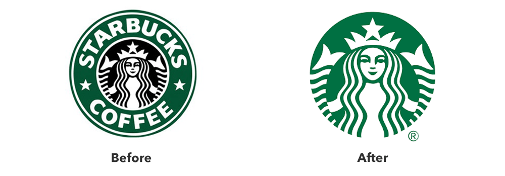
Starbucks removed its name from the logo in 2011, opting to use only the image of the siren. While the siren itself is iconic, the removal of the brand name led to confusion among some consumers who didn’t recognize the logo immediately.
What We Can Learn:
Sometimes, a logo’s evolution needs to be done gradually. While the siren is undoubtedly a part of Starbucks’ identity, removing the name was a risky move that left many people unsure about the company behind the logo. It’s important to make bold changes carefully, particularly with established brands.
8. Animal Planet (2008 Rebrand)
What Went Wrong:
Animal Planet’s 2008 rebrand featured a logo that was hard to read and lacked the wild, adventurous energy that the channel had been known for. The redesign also caused confusion by mixing too many design elements, making it appear cluttered.
What We Can Learn:
A logo should reflect the energy and personality of the brand it represents. A busy design can confuse customers and fail to communicate your brand’s core values. When rebranding, make sure the design matches the essence of the company—particularly when it’s tied to an exciting industry like entertainment.
Conclusion: Learning from Logo Fails
Logo design is an art, and like any art form, there’s always room for failure. But the key takeaway from these logo fails is that it’s essential to understand your brand, maintain consistency, and make sure your logo is both simple and meaningful. When done right, a logo has the power to tell your story, evoke emotions, and build trust with your audience.
So, next time you’re thinking of changing your logo, make sure you avoid the mistakes of the past and remember that sometimes, the old design is still the best design.
