Google’s logo is a global superstar—a technicolor beacon that’s guided us through the wilds of the internet for over 25 years. What started as a scrappy doodle in a Stanford dorm has morphed into a sleek, sans-serif icon that’s as recognizable as the Golden Arches or the swoosh of Nike. But this isn’t just a tale of pretty letters—it’s a saga of design daring, cultural clout, and a few eyebrow-raising controversies. In this 3,500-word odyssey, we’ll unpack the Google logo’s birth, its rainbow hues, its role in defining eras, and its lessons for anyone wielding a logo generator AI free tool today. Buckle up—it’s a wild ride from BackRub to billions!

The Birth of a Logo: From BackRub to “G”
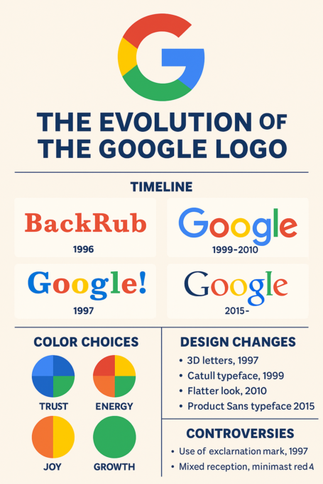
Imagine 1996: two PhD students, Larry Page and Sergey Brin, are tinkering with a search engine called “BackRub.” Yes, BackRub—a name that sounds more like a massage parlor than a tech titan. Its logo? A clunky red wordmark that screamed “we’re trying!” Thankfully, they ditched it in 1997, rebranding to “Google”—a playful riff on “googol” (10^100), symbolizing their mission to organize the infinite web. Sergey whipped up the first Google logo using GIMP, a free graphics tool, proving you don’t need a fat budget—or a logo generator by prompt—to kickstart a revolution.
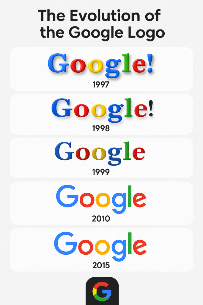
That debut logo was a multicolored mess: 3D letters in blue, red, yellow, and green, with an exclamation mark cribbed from Yahoo!. “It was like a kid’s finger-painting—charming, but chaotic,” quips design historian Ryan Edward Russell. By 1998, it slimmed down to Baskerville Bold, a serif font with a green “G” and a quirky color scheme. Then, in 1999, Ruth Kedar, a Stanford design prof, stepped in. Her version—using the Catull font—kept the colors but added polish. “We wanted something traditional yet surprising,” Kedar said. That logo stuck until 2010, laying the foundation for Google’s iconic identity.
Color: A Rainbow with a Reason
Google’s logo is a color explosion—blue, red, yellow, green—breaking the monochrome mold of 90s tech. Why? “We didn’t want to follow rules,” Kedar explained, noting the offbeat “L” in green as a rebel yell. Blue evokes trust, red screams energy, yellow sparks joy, and green nods to growth—psychology 101 for branding. “It’s a palette that says, ‘We’re serious, but we’re fun,’” says Claudine Jaenichen, an information design expert.
In 2015, Google swapped Catull for Product Sans, a custom sans-serif, but kept the colors. Why mess with perfection? That rainbow has become a memory hook—96% of schoolkids recognize it, per a 1997 study. Could an AI logo generator dream up such a vibe? Maybe, but Google’s human touch made it stick.
Artistry and Design Patterns: From Clunky to Crisp
Google’s logo evolution is a masterclass in shedding baggage. The 1997 version was a 3D relic—think early CGI vibes. By 1999, Kedar’s Catull design brought elegance with serifs and subtle shadows. “It was sophisticated but still playful,” Russell notes. Then, in 2010, Google flattened it—less shadow, more modern. The 2015 Product Sans leap was the biggie: flat, geometric, and mobile-friendly. “Circles are the new squares,” joked designer Nate Clinton, highlighting its fingertip-inspired curves.
This shift mirrors design trends—flat design ruled the 2010s, and Google rode the wave. It’s a lesson for anyone using a logo generator AI free tool: simplicity scales. From pixelated screens to smartwatches, Google’s logo flexes without breaking.
Controversies: When Logos Stir the Pot
Google’s logo hasn’t dodged drama. In 1999, its Yahoo!-aping exclamation mark sparked snickers—imitation or flattery? Bigger trouble hit in 2015 with the Product Sans reveal. Some X users griped, “It’s too corporate!” Others mourned the “fun” of serifs. “Google’s trying too hard to be friendly,” Wired snarked. And don’t forget the 2021 app icon fiasco—its white “G” on a white background baffled users. “It’s like they forgot contrast exists,” Jaenichen laughs.
Then there’s the Doodle debates. These logo tweaks—think Pac-Man in 2010 or Frida Kahlo in 2007—delight millions but irk purists. The Pac-Man Doodle reportedly cost $120 million in lost productivity. Worth it? You decide. Controversies prove logos aren’t just art—they’re lightning rods.
Stock Price: Did the Logo Move Markets?
Did logo changes juice Google’s stock? Alphabet (Google’s parent) went public in 2004 at $85 a share with the 1999 logo. By the 2010 tweak, it hit $300. The 2015 redesign? Stock soared past $700 within a year, peaking at $3,000+ by 2021. Coincidence? Maybe. “A logo doesn’t make a company, but it signals confidence,” says financial analyst Mia Vargas. The 2015 shift aligned with Alphabet’s birth, reassuring investors Google wasn’t just a search engine anymore. No AI logo generator can claim that clout.
The Logo’s Role in Defining Eras
Google’s logo is a time capsule. The 1997-1998 chaos mirrors a scrappy startup. The 1999-2010 Catull era screams “dot-com survivor”—polished yet playful as Google outlasted the bubble. The 2010 flatten signaled maturity; the 2015 Product Sans leap marked the “tech overlord” phase—Android, YouTube, and beyond. “It’s grown up with us,” Russell muses.
Doodles define mini-eras too. The 1998 Burning Man sketch kicked off a tradition—now, 4,000+ Doodles celebrate everything from Beethoven to Holi. Each logo shift maps Google’s ascent from dorm room to dominance.
Design Lessons from Google’s Logo Evolution
Wanna craft a killer logo with a logo generator by prompt? Google’s got tips:
- Simplicity Wins: From 3D to flat, less is more.
- Color Pops: Four hues beat one—stand out.
- Adapt or Fade: Mobile-first forced the 2015 pivot.
- Symbolism Matters: Colors and shapes tell your story.
- Test It: Google’s iterations show trial beats error.
“AI can sketch, but humans refine,” Jaenichen says. Google’s logo proves design’s a dance of instinct and iteration.
Symbolism: More Than Meets the Eye
Google’s logo is a symbol salad. The “G” isn’t just a letter—it’s unity in diversity, with four colors mirroring its sprawling services. The 2015 circles nod to connectivity—think speech bubbles or Wi-Fi dots. “It’s a logo that talks,” Clinton says. The rainbow palette? Innovation, inclusivity, and a wink at “don’t be evil” (RIP, motto). Even the Doodles—like 2014’s Harriet Tubman tribute—pack meaning, educating as they entertain.
Impact on Society: A Logo That Shapes Us
Google’s logo isn’t just branding—it’s a cultural juggernaut. That “G” on your phone cues instant trust—billions search daily under its watch. “It’s Pavlovian,” Russell quips. “See it, click it.” Doodles spark chatter—#GoogleDoodle trends yearly, from Olympics to obscure inventors. The 2010 Pac-Man game? A nostalgia bomb that glued us to screens.
It’s also a social mirror. Pride Doodles cheer inclusivity; climate ones nudge green vibes. Yet, it’s not all rosy—#BoycottGoogle flares over privacy gripes. Love it or loathe it, this logo’s baked into our lives.
Design Anatomy: Breaking Down the “G”
Dissect the 2015 logo: Product Sans is a geometric sans-serif—clean, bold, scalable. The “G” splits into four color blocks—blue top-left, red top-right, yellow bottom-left, green bottom-right. Circles dominate, from “O”s to Doodle dots. “It’s math meets art,” Jaenichen says. Compare it to a logo generator AI free output—Google’s precision feels hand-tuned, not algorithm-spat.
Messaging: What’s the Logo Saying?
“Search me!” the 1997 logo winked. By 1999, it whispered, “We’re legit.” The 2015 version? “We’re everywhere—deal with it.” Doodles shout, “Hey, learn something!” The messaging evolved from quirky to commanding, mirroring Google’s shift from underdog to overlord. “A logo’s a megaphone,” Vargas notes. Google’s blasts loud and clear.
Hashtag History: #GoogleDoodle and Beyond
Google’s logo fuels social buzz. #GoogleDoodle took off in the 2000s—think 2017’s school-start sketch or 2020’s Beethoven game. #NewGoogleLogo spiked in 2015, splitting fans. “Half loved it, half cried ‘sellout,’” Russell recalls. Hashtags amplify its reach—Pac-Man’s $120M chaos went viral pre-Twitter. Today’s AI logo generator users could only dream of such clout.
Growth: From Dorm to Domination
The logo tracks Google’s rise. The 1997 scribble matched a $100,000 seed. By 1999, $25 million in funding met Kedar’s polish. The 2015 redesign? A $500 billion valuation flex. Each tweak reflects scale—more services, more screens, more power. “It’s a growth chart in pixels,” Clinton says.
Impact of Technology: Pixels to Pixels
Tech shaped the logo’s arc. The 1997 3D look fit clunky CRTs. The 2010 flatten suited HD screens. The 2015 shift? Mobile-first—75% of searches now happen on phones. “It’s fingertip-friendly,” Clinton notes. Doodle animations lean on HTML5, while the “G” flexes for AR/VR. Could a logo generator by prompt keep up? Google’s tech dance says human ingenuity still leads.
Conclusion: A Logo for the Ages
Google’s logo is no mere mark—it’s a mirror of our digital age. From BackRub’s red scrawl to Product Sans’s sleek “G,” it’s evolved with wit, grit, and a splash of color. It’s taught us simplicity, sparked debates, and smiled through Doodles. Whether you’re crafting your own with an AI logo generator or just Googling “cat videos,” this logo’s legacy is undeniable. “It’s not just a design—it’s a vibe,” Jaenichen sums up. Here’s to the next 25 years of Google’s rainbow reign!
✨ Ready to design a logo that blends emotion, innovation, and timeless appeal?
Try our free logo generator AI tool and bring your brand story to life — no design skills needed.
💡 Want to avoid the common pitfalls in logo design?
Keep exploring our blog for expert insights, brand breakdowns, and AI-powered design tips that help you stand out
