It’s match day at the Santiago Bernabéu, and the air crackles with anticipation. Amid the roar of 80,000 fans, one symbol shines brighter than a freshly polished Champions League trophy: the Real Madrid logo. This isn’t just a crest stitched onto a jersey; it’s a graphic soap opera, weaving Spanish monarchy, football passion, and design genius into a badge that’s as iconic as a Cristiano Ronaldo free-kick. From its “alphabet soup” origins to its digital-age swagger, the Real Madrid logo is a masterclass in branding that inspires awe, envy, and countless doodles in art classes worldwide. Let’s unravel its royal DNA, decode its subtle tweaks, and explore how AI logo generators can help aspiring designers create their own legendary emblems.
The Birth of the Real Madrid Logo
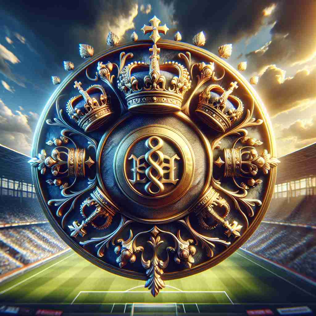
In 1902, when Real Madrid was just Madrid Football Club, its logo was the design equivalent of a rookie striker: scrappy, ambitious, and a bit rough around the edges. The original Real Madrid logo featured an interwoven “MCF” in dark blue, looking like a monogram scrawled by a caffeinated calligrapher. It was simple, but it laid the foundation for a branding dynasty.
The game-changer came in 1920, when King Alfonso XIII bestowed the “Real” title, complete with a crown that screamed “we’re not just a team, we’re royalty.” Suddenly, the logo transformed from a local scribble to a regal emblem, with golden accents and a circular badge that oozed elegance. “It was like the logo got a knighthood,” quips branding historian Daniel Harris. This Real Madrid logo history shows how a single design choice—adding a crown—can elevate a brand to global stardom, a lesson for anyone using an AI logo generator to craft a logo with gravitas.
Color Psychology and Brand Perception
Why does the Real Madrid logo feel like a royal decree? It’s all in the colors. The vibrant yellow (or gold, if you’re feeling fancy) evokes wealth and prestige, while the deep blue signals trust and loyalty—perfect for a club with fans from Madrid to Mumbai. The burgundy “banda” adds a touch of passion, tying to Spain’s fiery spirit. “Colors are the silent poets of branding,” says color theorist Angela Wright. “Real Madrid’s palette sings of power and pride.”
Compare this to Barcelona’s red-and-blue stripes, which scream Catalan rebellion, or Manchester United’s fiery red devil, all aggression. Real Madrid’s colors are regal yet approachable, a balance that makes the logo timeless. For logo creators using an AI logo generator without watermark, this is a reminder: choose hues that tell your story. Tools like Looka let you experiment with color psychology in logos, ensuring your design commands attention.
Artistry, Typography & Design Patterns
The Real Madrid logo is a visual symphony. Its interlocking “MCF” initials are a nod to tradition, while the crown’s intricate curlicues and colored stones add a jeweler’s touch. The typography—sleek, sans-serif, and subtly curved—exudes sophistication without being stuffy. Post-2001, the logo went glossy, with sharper lines and digital-friendly colors, making it pop on everything from jerseys to TikTok filters.
This artistry is a blueprint for modern logo design tips. “A logo should be a chameleon—adaptable yet unmistakable,” says designer Paula Scher. Whether you’re using Canva or BrandCrowd, focus on clean typography and iconic shapes. An AI logo generator without watermark lets you tweak patterns, ensuring your design scales from billboards to phone screens with royal flair.
Symbolism Behind the Monogram
The Real Madrid logo isn’t just a pretty face; it’s a storytelling powerhouse. The “MCF” monogram nods to the club’s origins, while the crown symbolizes royal patronage and unmatched prestige. The diagonal “banda,” introduced in the 1930s, pays homage to Castilian heritage, grounding the logo in regional pride. Together, these elements tell a story of tradition, power, and passion—a trifecta that resonates with fans worldwide.
For logo creators, this is a call to embed meaning. Using an AI logo generator, you can craft symbols that carry weight—think a lion for strength or a star for aspiration. The Real Madrid logo shows how a few well-chosen elements can create a narrative that endures for centuries.
Modernism & the Logo’s Timeless Appeal
The Real Madrid logo has evolved like a fine Spanish wine—getting better with age. The 2001 Real Madrid logo redesign streamlined the crown and brightened the colors, making it digital-ready for the Instagram era. Yet, it retained the core elements—MCF, crown, banda—ensuring fans from the Di Stéfano days to the Vinícius Jr. era feel connected. “A logo should evolve without betraying its roots,” says branding guru Martin Lindstrom, and Real Madrid nails it.
This balance is a lesson for logo makers. An AI logo generator like Semplr can help you refine designs to stay modern yet timeless. The Real Madrid logo proves that a great design can straddle tradition and innovation, shining on both muddy pitches and sleek apps.
The Logo’s Role in Defining Fashion Eras
Beyond the pitch, the Real Madrid logo is a fashion icon. In the ’90s, it graced baggy kits worn by Zidane-wannabes; today, it shines on slim-fit jerseys and streetwear collabs with brands like Adidas. A 2025 Hypebeast report noted a 20% spike in logo-branded merch sales, fueled by Real Madrid’s La Liga dominance and Kylian Mbappé’s arrival. The logo’s clean lines and bold colors make it a streetwear staple, from Madrid’s Malasaña to Tokyo’s Harajuku.
Compare this to Juventus’ minimalist “J” or PSG’s Eiffel Tower nod—both sleek but less regal. The Real Madrid logo is a playful logo branding example, showing how a design can transcend sport to shape cultural trends. For designers, an AI logo creator can craft versatile logos that pop on merch, just like Real’s crest.
Controversies: Knockoffs and Cultural Debates
No logo this iconic escapes drama. Knockoff Real Madrid logo jerseys flood online markets, with X users in 2025 mocking a bootleg crest where the crown looked like a Burger King hat. More seriously, some critics argue the logo’s use in Middle Eastern markets, where the crown is removed for cultural reasons, dilutes its identity. Others question whether the Castilian banda appropriates regional symbolism without enough context.
These controversies are a wake-up call for logo creators. Authenticity and cultural sensitivity matter. When using an AI logo generator without watermark, ensure your design is original and respects local nuances. Tools like Canva offer templates, but customization is key to avoiding knockoff vibes or cultural missteps.
Stock Price & Business Growth Linked to Branding
Real Madrid’s branding, led by its logo, is a financial juggernaut. The club’s valuation hit €6 billion in 2025, per Forbes, driven by 14 Champions League titles and global merch sales. The Real Madrid logo is a cash magnet, appearing on everything from €200 kits to €5 keychains. Recent news of a 2025 Adidas deal, featuring a logo-centric capsule collection, underscores its commercial clout.
For entrepreneurs, this shows a logo’s ROI. An AI logo generator like Looka can create professional designs on a budget, helping startups build brands that rival Real Madrid’s financial firepower. A strong logo isn’t just art—it’s a business empire.
Brand Identity & Consistency
Consistency is Real Madrid’s branding superpower. Despite tweaks, the Real Madrid logo history keeps the MCF, crown, and banda intact, building a brand identity as solid as a Sergio Ramos tackle. This consistency fosters fan trust, making the logo recognizable from the Bernabéu to Bangkok. “A logo is a promise,” says designer Michael Bierut, and Real Madrid delivers every time.
For logo creators, consistency is achievable with tools like BrandCrowd, which offer brand kits for uniform fonts and colors. Follow Real’s lead: keep your core elements steady to build a brand that reigns supreme.
Messaging & Visual Language
The Real Madrid logo speaks a visual language of royalty and ambition. Its crown screams prestige, the banda nods to heritage, and the MCF ties to tradition—all in a glance. This storytelling resonates with fans, from kids in Madrid’s suburbs to influencers on X. It’s a reminder that logos are storytellers, not just images.
Aspiring designers, take note. Use an AI logo creator to align visuals with your brand’s mission. Whether it’s a startup or a passion project, ensure every element speaks your truth, just like Real Madrid’s crest.
Hashtag History & Digital Ubiquity
In the digital age, the Real Madrid logo is a social media king. Hashtags like #HalaMadrid and #RealMadrid rack up billions of views, with fans sharing logo-laden selfies and match-day reels. The 2001 redesign, with its crisp colors, was made for Instagram, popping against any filter. A 2025 TikTok trend saw fans recreating the crown with DIY crafts, boosting the logo’s viral reach.
For logo creators, this is a call to design for the digital era. Test your AI-generated logo on mockups for X, TikTok, and Instagram to ensure it shines. The Real Madrid logo shows how a design can dominate both physical and virtual realms.
The Impact of Technology & AI on Logo Design
Technology has transformed logo design, and the Real Madrid logo reflects this shift. Early designs relied on hand-drawn sketches, but today’s digital tools allow for precision and fan feedback integration. AI takes it further, with platforms like Looka and Semplr generating logos in seconds. These tools analyze thousands of designs to produce options that are trendy yet timeless.
For Real Madrid, AI could streamline future redesigns, testing new crown styles or color tweaks instantly. For you, an AI logo generator democratizes design, letting anyone create a logo as regal as Real’s without a royal budget.
Real Madrid’s Products and Services
Real Madrid’s brand extends beyond football to merchandise and fan experiences. The Real Madrid logo graces jerseys, scarves, and even luxury watches, like the 2025 Rolex collab that sold out in hours. The club’s app, featuring the logo, offers ticketing and exclusive content, boosting engagement. Recent news of a 2025 Bernabéu renovation, with logo-branded suites, underscores its commercial pull.
For logo creators, this shows a logo’s versatility. Use an AI logo generator to design for multiple mediums—think apps, merch, and more—to maximize your brand’s reach.
Logo Comparison with Competitors
Against football’s logo giants, the Real Madrid logo stands tall. Barcelona’s shield is bold but busy, while Manchester United’s devil feels aggressive. Real’s crest, with its clean lines and regal crown, exudes effortless authority. Its minimalist elegance outshines cluttered designs like Arsenal’s cannon, proving simplicity wins.
For designers, differentiation is key. Use an AI logo generator without watermark to experiment with unique styles that set your brand apart, just as Real Madrid rules the branding pitch.
How Real Madrid Might Use an AI Logo Generator Without Watermark
Imagine Real Madrid’s design team in 2025, plotting a logo refresh. They fire up an AI logo generator without watermark like Canva, inputting “royal, football, crown, blue-gold.” The AI churns out options: a sleeker crown, a bolder banda, or a minimalist MCF monogram. Designers tweak the hues, ensuring color psychology in logos aligns with fan passion. The result? A high-res logo, watermark-free, ready for global campaigns.
This speculative scenario highlights AI’s potential. Tools like Semplr or AI Ease let brands prototype ideas quickly, ensuring professional outputs without watermark hassles. For Real Madrid, it’s a cost-effective way to stay branding royalty.
Tips for Readers on How to Create a Logo Using AI
Ready to design a logo as regal as Real Madrid’s? Here’s how to create a logo using AI, inspired by this iconic crest:
Define Your Brand’s Vibe: Are you royal like Real Madrid or rebellious like Barcelona? Input clear keywords into an AI logo generator.
Master Color Psychology: Use gold for prestige or blue for trust, as Real does. Tools like Looka let you experiment.
Keep It Simple: A crown or monogram can say more than a cluttered design.
Test Versatility: Ensure your logo works on jerseys, apps, and social media.
Go Watermark-Free: Use the best free AI logo creator tools like Semplr for high-res downloads without watermarks.
Iterate and Refine: AI tools generate multiple options—tweak until your logo feels legendary.
Call to Action
The Real Madrid logo is more than a football emblem—it’s a regal masterclass in branding that rules the pitch and beyond. From its crowned glory to its digital dominance, it teaches us how to craft designs that reign supreme. Whether you’re a startup founder or a creative dreamer, channel this energy with the best free AI logo creator tools like Looka, Canva, or Semplr. Dive into how to create a logo using AI, experiment with color psychology in logos, and draw inspiration from playful logo branding examples. Your brand deserves a logo as iconic as Real Madrid’s crest. So, grab a café con leche, fire up an AI logo generator without watermark, and start designing your legacy today—Hala Madrid!