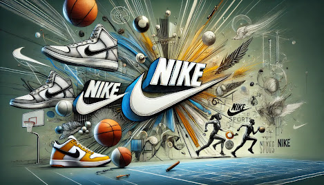
The Nike Swoosh is one of the most recognizable logos in the world. It’s simple, dynamic, and instantly associated with sports, movement, and excellence. But have you ever wondered how it came to be? The story behind Nike’s logo is a perfect example of how branding, consistency, and evolution can transform a company into a global powerhouse.
The Birth of the Swoosh: A $35 Design
Back in 1971, Nike was still known as Blue Ribbon Sports, a company founded by Phil Knight and Bill Bowerman. When Knight decided to create his own brand of athletic shoes, he needed a logo. He turned to Carolyn Davidson, a graphic design student at Portland State University, who was tasked with creating a logo that represented movement and speed.
Davidson presented several ideas, and Knight ultimately chose the now-famous Swoosh. It wasn’t love at first sight—Knight reportedly said, “I don’t love it, but it will grow on me.” For her work, Davidson was paid just $35. (Luckily, Nike later compensated her with stock options, which became worth millions.)
The Meaning Behind the Swoosh
The Swoosh is more than just a checkmark-like symbol—it embodies movement, agility, and victory. The design was inspired by the wings of Nike, the Greek goddess of victory, aligning perfectly with the company’s athletic focus. Its sleek, forward-moving shape symbolizes speed and progression, making it a perfect fit for a sports brand.
Nike’s Logo Evolution
Although the Swoosh has remained central to Nike’s brand identity, it has undergone subtle changes over the years:
- 1971 – The original logo featured the Swoosh on its own, often paired with different wordmarks.
- 1978 – The first major evolution saw the introduction of the bold “NIKE” text in all caps, giving the logo a stronger presence.
- 1985 – The logo was adjusted again, often appearing alongside the “Just Do It” slogan, further cementing its identity.
- 1995 – The brand became confident enough in its recognition that it dropped the text entirely. The Swoosh now stood alone, a powerful symbol of the company’s dominance.
The Role of the Logo in Nike’s Success
Nike’s logo played a massive role in its global success. Here’s how:
- Instant Recognition – The Swoosh is simple yet striking, making it easy to recognize anywhere in the world.
- Emotional Connection – Over time, the logo became associated with legendary athletes like Michael Jordan, Serena Williams, and Cristiano Ronaldo, reinforcing its meaning of excellence and victory.
- Brand Loyalty – The logo represents more than just shoes—it represents an attitude, a lifestyle, and a commitment to pushing limits.
- Marketing Power – Nike’s marketing campaigns, from “Just Do It” to collaborations with top designers, have leveraged the power of the Swoosh to stay ahead in the industry.
Final Thoughts: A Lesson in Branding
Nike’s logo is a masterclass in branding. It started as a $35 design and became a global icon, proving that great logos don’t need to be complex—they just need to be meaningful, adaptable, and consistently used over time.
For any business owner or designer, Nike’s logo journey is a reminder that the best branding decisions are often the ones that stand the test of time. Simple, bold, and emotionally resonant—that’s the power of a great logo.