Logoluv

Author

Ashley Brown page 11

Every story Ashley Brown has written for LogoLuv: the history, design and meaning behind famous logos.

Iconic Logos

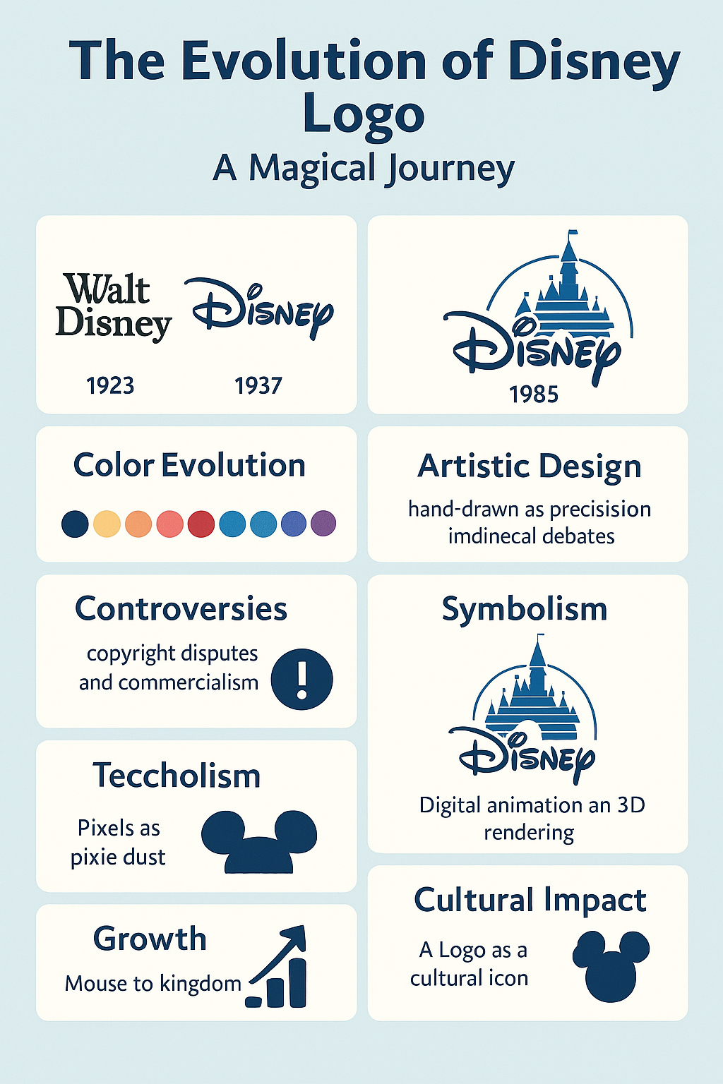
The Disney Logo, From Mickey to the Castle

Disney’s first “logo” was nothing more than Walt Disney’s name in blocky serif type on the Alice Comedies. A century later the company signs its films with a glowing 3D castle and a shooting star, and the route between the two says a lot about how a brand grows up.
· 8 min read

Iconic Logos

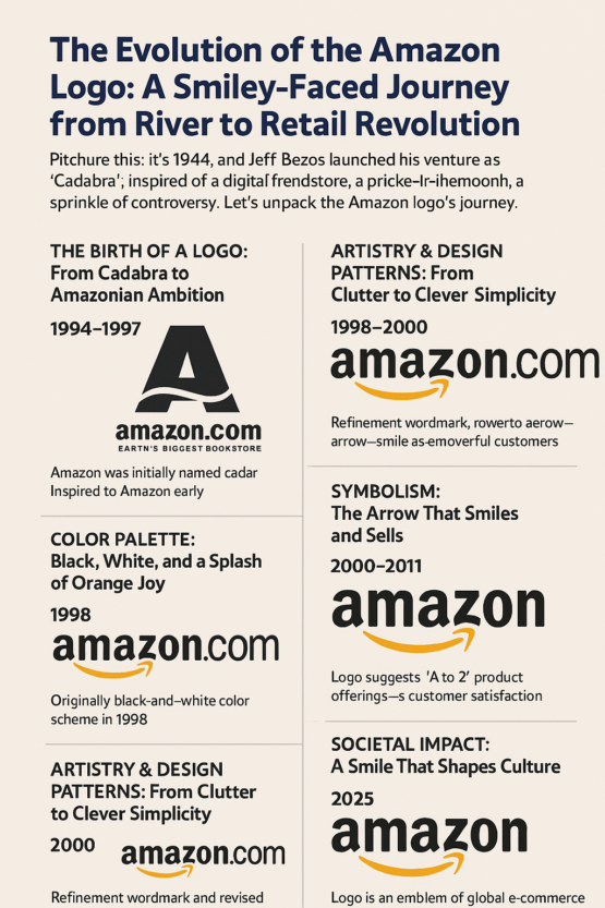
The Amazon Logo, From River to Smile

Amazon nearly launched as Cadabra, until Jeff Bezos’s lawyer misheard the name as “cadaver.” The logo that followed went through a river, zebra stripes, a giant O and a yellow swish before it landed, in 2000, on the orange arrow that runs from a to z and doubles as a smile.

· 7 min read

Logo Fun

8 Worst Logo Fails and What They Teach

Gap’s 2010 logo lasted about a week. That is the record on this list, but it is not the only redesign that a big company paid for, launched with confidence and then had to defend, rethink or quietly drop.

· 4 min read

Iconic Logos

The Harley-Davidson Logo: The Bar and Shield Since 1910

Harley-Davidson built motorcycles for seven years before it had an official logo. When the Bar and Shield arrived in 1910, it looked less like a piece of branding than a license plate bolted to a badge, and that plainness is exactly why it has lasted.

· 7 min read

Iconic Logos

The Coca-Cola Logo: A Script That Barely Changed

The Coca-Cola logo was written, not designed. In 1886 Frank Mason Robinson, the bookkeeper to the drink’s inventor, wrote the name out in the Spencerian handwriting taught in American schools, and that piece of penmanship is still on every can.

· 6 min read

Logo Fun

Hidden Meanings in Famous Logos and How to Design Smarter

The Baskin-Robbins logo has had the number 31 hidden in it for years, tucked into the pink parts of the B and the R, and most customers never notice. Once you do see it, you can’t stop seeing it, and that is exactly what makes a hidden detail worth putting into a logo.

· 6 min read

Iconic Logos

McDonald’s Logo: The Golden Arches Story

The golden arches started as part of a building. Before they were a letter M, they were two huge yellow parabolas holding up the roof of a McDonald’s restaurant, designed to be seen from a moving car.

· 7 min read

Iconic Logos

The Nike Logo: Swoosh History, Variations and Controversies

For most of its first 25 years, the Nike Swoosh did not appear on its own. It came with the word NIKE sitting on top of it, first in chunky 1970s capitals and later in Futura Bold, and only in 1995 did the company decide the curve could carry the brand by itself.

· 7 min read