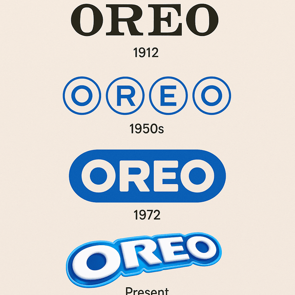
The Oreo Logo: From a 1912 Wordmark to Bold Blue
When Nabisco launched the Oreo in 1912, its logo was a stamp rather than a design: a plain wordmark whose only job was to tell you whose cookie you were holding. More than a century later the name sits in heavy, rounded capitals on a deep blue field, and that blue has become as much a part of the cookie as the cream.